HTML5 notes
Chapter 1: Web page building blocks
- The HTML5 doctype is
<!DOCTYPE html>. - Elements that were previously called inline are now called phrasing content — that is, elements and their contained text that primarily appear within a paragraph. Visit http://dev.w3.org/html5/spec-author-view/content-models.html#phrasing-content-0 for a full list.
- The old block-level elements now fall into new HTML5 categories that focus on their semantics.
- Key concept: Choose the elements that best describe the meaning of your content without regard for their presentation.
Semantics of a basic HTML5 page
- All the content is contained in an article element. Article defines a distinct piece of content.
- HTML provides six heading levels, h1-h6, with h1 being the most important. Every HTML page should have one or more h1 elements.
- The img element is the primary choice for displaying an image. The alt attribute provides text that displays if the image doesn't load or if the page is viewed in a text-only browser.
- Paragraphs are marked up with p elements.
- Em and a elements are examples of phrasing content elements. Em is used for emphasis. It's common to render em text in italics. The a (anchor) element links one page to another page or resource.
The power of the Web is in its universality. Access by everyone regardless of disability is an essential aspect.
—Tim Berners-Lee
Markup: elements, attributes & attribute values
Elements
- Elements are like little labels that describe the different parts of a Web page: "This is a heading, that thing over there is a paragraph, and that group of links is navigation."
- Elements can contain text or other elements or they can be empty.
- A non-empty element consists of a start tag (the element's name and attributes, if any, enclosed in less-than and greater-than signs), the content, and an end tag (a forward slash followed by the element's name, again enclosed in less-than and greater-than signs).
- Empty or void elements look like a combination start and end tag, with an initial less-than sign, the element's name followed by any attributes it may have, an optional space, an optional forward slash, and the final greater-than sign. The space and forward slash before the end of an empty element are optional in HTML5.
- It's customary to type element names in all lowercase although HTML5 isn't picky.
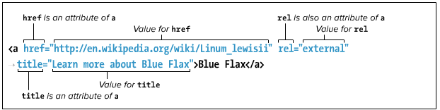
Attributes & attribute values
- Attributes contain information about the content in the document as opposed to being the content itself.
- It HTML5, an attribute's value may optionally be enclosed in quotation marks, but it's customary to include them.
- Some attributes can accept any value; others are more limited. The most common are those that accept enumerated or predefined values. Write enumerated values in all lowercase letters.
- Many attributes require a number for their value, particularly those describing size and length. A numeric value never includes units, just the number. Where units are applicable, as in the width and height of an image or video, they are understood to be pixels.
Parents & children
- If one element contains another, it is considered to be the parent of the enclosed, or child element. Any elements contained in the child elements are considered descendants of the outer, parent, element.
- The underlying, family-tree like structure is a key feature of HTML. It facilitates both styling elements and applying JavaScript behavior to them.
- When elements contain other elements, each element must be properly nested, that is, fully contained within its parent.
A web page's text content
- When a browser renders HTML, it collapses extra spaces or tabs into a single space and either converts returns and line feeds into a single space or ignores them altogether.
- It's standard practice to encode pages in Unicode (UTF-8) and save HTML files with the same encoding. Even so, it's still common to use character references at times, such as for the copyright symbol, since it's easy to both remember and type
©. Specify your documents character encoding directly after the head start tag. The charset attribute sets the encoding type.<meta charset="utf-8" />
File names
- User lowercase file names for web pages for ease of use by site visitors.
- Separate words with a dash. Underscores aren't recommended because dashes are preferred by search engines.
- The extension .html is preferred over .htm for custom's sake.
URLs
- Uniform Resource Locater, or URL, is a fancy name for address.
- The first part of the URL is called the scheme. The most common scheme is HTTP, or Hypertext Transfer Protocol. Always type schemes in lowercase.
- Other common schemes are https, for secure web pages; ftp (File Transfer Protocol) for downloading files; mailto, for sending email; and file, for accessing files.
- A scheme is generally followed by a colon and two forward slashes.
- Mailto and news are exceptions: these take only a colon.
- The file scheme is followed by a colon and three slashes because the host, which in other schemes goes between the second and third slashes, is assumed to be the local computer. To reference a file on a local Windows machine, use the file scheme, e.g., file:///c|path/home.htm. For Macintosh, use file:///Harddisk/path/filename.
- The second part of the URL is the name of the server where the file is located, followed by the path that leads to the file, and the file's name itself. When a URL omits a file name and ends with a path, which may or may not include a trailing forward slash, the URL refers to the default file in the last directory in the path, typically called index.html.
Extra
Nice infographic on HTML5 at Focus.com: http://www.focus.com/images/view/11905/.
Chapter 2: Working with web page files
- On a web server, hiding the list of files for folders that contain assets is advisable as is having a default page in each directory that contains HTML pages.
- When code is shown using different colors to distinguish page content from HTML elements, attributes, and attribute values, it is called syntax highlighting.
Chapter 3: Basic HTML structure
Starting a web page
- At its most basic level, each of your HTML documents should contain the following components:
- The
DOCTYPE - The
htmlelement (with the lang attribute, which is optional but recommended)- The
headelement- The character encoding in a
metaelement - The
titleelement
- The character encoding in a
- The
bodyelement
- The
- The
<!DOCTYPE html>
<html lang="en">
<head>
<meta charset="UTF-8" />
<title></title>
</head>
<body>
</body>
</html>
- For performance reasons, it's preferable most of the time to load JavaScript right before the end (
/body) tag at the bottom of your page.
Creating a title
- Each HTML page must have a
titleelement. Atitleshould be short, descriptive, and unique to each page. - Search engines have different algorithms that determine a page's rank and how its content is indexed. Universally, though,
titleplays a key role. An effectivetitlefocuses on a handful of key words that are central to a page's content.- As a best practice, choose
titletext that briefly summarizes a document's content to benefit both screen reader users and search engine rankings. - Optionally, indicate your site's name in the
titleat the end of the site. - Get your
title's core message into the first 60 characters, including spaces, because search engines often cut them off in their results around that number.
- As a best practice, choose
Creating headings
- Use headings to define your document structure, just like an outline.
- Choose heading levels solely based on what hierarchy is appropriate for your content, not on how big or small you want the text to appear.
- Search engines weigh your headings heavily, particularly h1 headings. Screen reader users often navigate a page by headings via the keyboard.
- You may add an
idto a heading if you want to create a link directly to it. - If a heading is in a different language, be sure to include the
langattribute.
Understanding HTML5's document outline
- HTML5 includes four sectioning content elements —
article,aside,nav, andsection— that demarcate distinct sections within a document and define the scope of theh1-h6(as well asheaderandfooter) elements within them. - Each sectioning element may have its own
h1-h6hierarchy. However, to accommodate screen readers and other assistive technologies, best practice is to start off with an h2 or lower if the sectioning element represents a subheading of an already existing h1 for a related chunk of content. Useh1-h6headings that indicate the hierarchy explicitly. - Typically, enclose all content that represents a self-contained composition (could be syndicated or stand-alone) within an
articleelement. - It's best practice to include each heading, and its accompanying content, within a
sectionelement. - Use Geoffrey Sneddon's HTML5 Outliner to see a visual representation of your document's outline.
Grouping headings
- Sometimes a heading has multiple consecutive levels, such as with headline subheadings, alternative titles, or tag lines. Grouping them into an
hgroupelement indicates they are related. - Each
hgroupmay contain only two or moreh1-h6headings; no other elements are allowed. - Only the first instance of the highest-ranked heading in an
hgroupappears in the document outline (especially good to keep tag lines out of the outline).
Common page constructs
- Site pages are often arranged into four main components: a masthead with navigation; an article in the main content area; a sidebar with tangential information; and a footer.
- Use the
header,nav,article,section,aside, andfooterelements to define the structure of your pages. Usedivas a generic container for additional styling and other purposes.
Header element
- Use
headerto contain a group of introductory or navigational content. Typically, aheadernear the top of a page may include the site's logo, the main navigation, other global links, and a search box. - A
headeris also appropriate for marking up a group of introductory or navigational content deeper within a page, for instance, a section's table of contents or the questions portion for a Frequently Asked Questions parentarticleelement. - Don't use
headerunnecessarily. If all you have is anh1-h6or anhgroupand no companion content worthy of grouping with it, there's no need to wrap it in aheaderin most cases. - You may not nest a
footerelement or anotherheaderwithin aheader, nor may you nest aheaderwithin afooteroraddresselement.
Nav element
- Links in a
navmay point to content within the page, to other pages or resources, or both. Usenavonly for your document's most important groups of links, not all of them. For instance, links within an aside element probably shouldn't be wrapped in anav. - Typically a
navelement will enclose anul(unordered list) element unless your links are breadcrumb links, in which case use anol(ordered list) element. - The
roleattribute is not required but can improve accessibility. Best practice is to include it with thenavelement, e.g.,<nav role="navigation">. - The HTML5 spec recommends not wrapping ancillary page footer links like "Terms of Use" and "Privacy Policy" in a
nav. However, if your page footer reiterates the top-level global navigation or includes other important links like "Store Locater" and "Careers," wrap those in anav.
Article element
- In HTML5,
articleis more akin to item. HTML5 defines it this way: Thearticleelement represents a self-contained composition in a document, page, application, or site and is, in principle, independently distributable or reusable, e.g., in syndication. This could be a forum post, a magazine or newspaper article, a blog entry, a user-submitted comment, an interactive widget or gadget, or any other independent item of content. - You can nest an
articleinside another one as long as the inner article is related to thearticleon the whole. You can't nest anarticleinside anaddresselement though. - Use
role="main"with anarticleelement when the element is the container for the page's main content. Otherwise userole="article"(other possible roles here aredocumentandapplication).
Section element
- The HTML5 definition for a
sectionis: Thesectionelement represents a generic section of a document or application. A section, in this context, is a thematic grouping of content, typically with a heading. - Examples of sections would be chapters, the various tabbed pages in a tagged dialog box, or the numbered sections of a thesis.
- A website's homepage could be split into sections for an introduction, news items, and contact information.
- You can use
role="main"with asectionelement when the element is the container for the page's main content.
Aside element
- An
asideis a section of content that is tangentially related to the main content on your page but that could stand on its own. - An
asidecould be nested within anarticleorsectionbut, if you want it to be visually treated differently, e.g., as a sidebar, it should not be nested. Browsers don't apply any special formatting to anasideby default (except starting them on their own line) but you can control the appearance with CSS. Best practice when using anasideas a side bar is to place it after your page's main content in the HTML. - The ARIA
role="complementary"on theasideis recommended. Other possibilities arenoteandsearch. - It's common to think of an
asideas a sidebar but you can place anasideelement in a variety of places in your page, depending on the context. It may be a box (conceptually or literally) within the main content itself, in the same column but not nested in the main content, or a secondary column like a sidebar. Examples of anasideinclude a pull quote, a sidebar, a box of links of related articles on a news site, advertising, groups ofnavelements (e.g., a blog roll), a Twitter feed, or a list of related products on a commerce site. - Use the
figureelement, notaside, to mark up figures that are related to your content, such as a chart, a graph, or an inset photo with a caption.
Footer element
- The
footerelement represents a footer for the nearestarticle,aside,blockquote,body,details,fieldset,figure,nav,section, ortdelement in which it is nested. It's the footer for the whole page only when its nearest ancestor is thebodyelement. - If a
footerwraps all the content in its section (anarticlefor example), it represents the likes of an appendix, index, long colophon, or long license agreement, depending on its content. - A
footertypically includes information about its section, such as links to related documents, copyright information, its author, etc. - A
footerdoesn't need to be at the end of its containing element, though it usually is. - It's invalid to nest a
headeror anotherfooterwithin a footer. Also you can't nest afooterwithin aheaderoraddresselement. - When a
footeris used as a footer for the whole page, userole="contentinfo".
Creating generic containers
- You may want to wrap a container around a section of content because you want to apply some styling with CSS or maybe an effect with JavaScript. However, the content doesn't warrant
article,section,aside,nav, or other elements. In this case, use adivelement as a container. - A
divelement doesn't have any of its own styling by default except that it starts on a new line. However, you can apply styles todivto implement your design. - The
spanelement is div's counterpart. Whereasdivis a semantic-less container for blocks of content,spanis one for phrases, like within apelement for paragraphs.
Improving accessibility with ARIA roles
- WAI-ARIA (Web Accessibility Initiative's Accessible Rich Internet Applications), or ARIA for short, is a specification that declares itself a "bridging technology." That is, it fills semantic gaps with attributes until languages like HTML provide their own equivalent semantics. For instance, what HTML markup would you use to let a screen reader know how to jump to (or past) the main content of your page? Or to a search box?
- ARIA's landmark roles solve these problems. The landmark roles are:
applicationbannercomplementarycontentinfoformmainnavigationsearch
- Individual landmark roles:
role="banner"- A region that contains mostly site-oriented content, rather than page-specific content.
- Site-oriented content typically includes things such as the logo or identity of the site sponsor and a site-specific search tool. A
bannerusually appears at the top of the page and typically spans the full width. - Usage: Add it to your page-level masthead (typically a header element), and use it only once on each page.
role="navigation"- A collection of navigational elements (usually links) for navigating the document or related documents.
- Usage: This mirrors HTML5’s
navelement, so add it to each nav element, or if one isn’t present, add it to the container around your links. You can use this role more than once on each page.
role="main"- The main content of a document.
- Usage: Add it to the container of your main section of content. Often this will be a div element, but it could be an article or section, too. Except in rare circumstances, your page should have only one area marked with
main.
role="complementary"- A supporting section of the document, designed to be complementary to the main content … but that remains meaningful when separated from the main content. The
complementaryrole indicates that the contained content is relevant to the main content. - Usage: This mirrors HTML5’s
asideelement, so add it to anasideordivthat contains all complementary content. You can include more than onecomplementaryrole in each page.
- A supporting section of the document, designed to be complementary to the main content … but that remains meaningful when separated from the main content. The
role="contentinfo"- A large perceivable region that contains information about the parent document. Examples of information included in this region of the page are copyrights and links to privacy statements.
- Usage: Add it once on a page to your page-level footer (typically a
footerelement).
role="form"- Redundant semantically with the
formelement.
- Redundant semantically with the
role="search"- Marks a search form.
- HTML elements and appropriate roles.
- <article role="article">. Possible roles: presentation, article, document, application, or main. Be sure to use main for the main content of a document.
- You can use ARIA role attributes in your CSS selectors.
- See the W3C's page Using ARIA in HTML5 for detailed information.
- NVDA (Windows, free download at www.nvda-project.org/), VoiceOver (free as part of Mac OSX and iOS 4+), and JAWS (Windows, free trial available at www.freedomscientific.com/) are among the most advanced screen readers available.
Naming elements with a class or id
- You can give your HTML elements a unique identifier (id), assign them one or more classes, or both. After doing so you can apply styles to all elements with a given
idorclassname. - The
idandclassattributes don't affect an element's appearance unless CSS references them. - Id:
- Use a unique
idattribute to identify it for later formatting, links, or JavaScript behavior. - The name of an
idcan be almost anything as long as it doesn't start with a number or contain any spaces. - Each
idin an HTML document should be unique. No two elements in the same page should be named with the sameidand each element may have only oneid. The sameidcan appear on multiple pages and doesn't have to be assigned to the same element each time, though it is customary to do so.
- Use a unique
- Class:
- Add a
classattribute to one or more elements to be able to format them all in one fell swoop. A particularclassname can be assigned to any number of elements in a page and an element may have more than oneclass. - If you want to assign more than one
class, separate each one with a space, as inclass="name anothername". - It's generally preferable to use
classoveridfor styling purposes because you can reuse its associated styles on other elements with the sameclass.
- Add a
- Choose meaningful names for your
ids andclasses. Avoid names that describe the presentation, likeclass="red".
Adding the title attribute to elements
- You can use the
titleattribute (not to be confused with thetitleelement) to add a tool tip label to practically any part of your website. They aren't just for tool tips though — screen readers may read title text to users, improving accessibility. - You can add
titles to any elements you wish, though it's most common to use them on links. - Internet Explorer 7 and earlier made tool tips out of the
altattribute used inimgelements. However, if both thetitleandaltattributes are present in an img element, the tool tip is set to the contents of thetitleattribute, not thealtattribute.
Adding comments
- In HTML, type
<!--to begin a comment and-->to complete the comment.- Use comments to note where sections begin or end, note revision information, or to comment to yourself (or future editors) the purpose of a particular piece of code.
- Content wrapped in a comment will not display.
- Comments may not be nested within other comments.
- CSS and JavaScript both use the syntax
*/ Comment goes here */. JavaScript also uses// Comment goes herefor single-line comments.
Chapter 4: Text
How content will look is irrelevant when deciding how to mark it up. So, you shouldn't use em or cite just because you want to italicize text — that's the job of CSS.
Paragraph (<p>)
- Usage:
<p>content here</p>
Line breaks (<br > & <wbr>)
- Browsers automatically wrap text according to the width of the block or window that contains content. It’s best to let content flow like this in most cases, but sometimes you’ll want to force a line break manually. You achieve this with the
brelement.- The
brelement is suitable for creating line breaks in poems, in a street address, and occasionally in other short lines of text that should appear one after another. Note: The hCard microformat (http://microformats.org/wiki/hcard) is “for representing people, companies, organizations, and places” in a semantic manner that’s human- and machine-readable. You could use it for a street address. - Never use
brto simulate spacing between paragraphs. Instead, mark up the two paragraphs withpelements and define the spacing between the two with the CSS margin property. - You can code br as either <br /> or <br> in HTML5; however the HTML5 spec shows it as <br>.
- The
- HTML5 introduces a cousin of
brcalledwbr. It represents “a line break opportunity.” Use it in between words or letters in a long, unbroken phrase (or, say, a URL) to indicate where it could wrap if necessary to fit the text in the available space in a readable fashion. So, unlikebr,wbrdoesn’t force a wrap, it just lets the browser know where it can force a line break if needed. Browser support is inconsistent as of this writing.
Spans (<span>)
- The
spanelement, likediv, has absolutely no semantic meaning. The difference is thatspanis appropriate around a word or phrase only, whereasdivis for blocks of content. spanis useful when you want to apply any of the following to a snippet of content for which HTML doesn’t provide an appropriate semantic element:- The
spanelement has no default styling. - Styling with CSS
- Behavior with JavaScript
- Because
spanhas no semantic meaning, use it as a last resort when no other element will do. - Microformats often use
spanto attach semantic class names to content as a way of filling the gaps where HTML doesn’t provide a suitable semantic element. You can learn more about them at http://microformats.org.
Contact information (<address>)
Addressdefines the contact information (and only the contact information) for the author, people, or organization relevant to an HTML page. It renders in italics by default.- Usage 1 (in an article in place of a paragraph):
<address>Email her at <a href="mailto:carol.mccue@gmail.com">carol.mccue@gmail.com</a>.</address> - Usage 2 (in a footer):
<address>Have a question or comment about the site? <a href="feedback.html">Contact our web team</a>.</address> - HTML5 forbids nesting any of the following elements inside address:
h1-h6,article,address,aside,footer,header,hgroup,nav, andsection.
Figures (<figure> & <figcaption>)
- A
figureis a self-contained piece of content, with an optional caption, that is referred to by the main content of your document. - The optional
figcaptionis afigure's caption or legend and may appear at the beginning or end of afigure's content. (It may not appear in the middle.) - The
figureelement may include multiple pieces of content, e.g., a chart for location and one for revenue. However, afigureelement can contain only onefigcaptionelement. Afigcaptionelement must be contained within afigureelement. - Usage:
<figure><figcaption>Figure 1, Teams by division</figcaption><img src="..."></figure>
Time & dates (<time>)
- You can mark up a precise time or calendar date with the
timeelement.- One of the most common uses of time is to indicate the publication date of an article element. To do so, include the
pubdateattribute. Thetimeelement withpubdaterepresents the publication date of the nearest ancestor article element - You could also time-stamp an article’s reader-submitted comments with
time,datetime, andpubdate, assuming each comment is wrapped in an article element that is nested in the article to which the comment relates
- One of the most common uses of time is to indicate the publication date of an article element. To do so, include the
- The optional text content inside
time(that is, <time>text</time>) appears on the screen as a human-readable version - The
timeelement can be utilized several ways.- The simplest form (the first example) lacks a
datetimeattribute. But it does provide the date and times in the valid format as required whendatetimeis omitted. - <p>Usage 1: The train arrives at <time>08:45</time> and <time>16:20</time> on <time>2012-04-10</time>.</p>
- Usage 2: <p>We began our descent from the peak of Everest on <time datetime="1952-06-12T11: 05:00">June 12, 1952 at 11:05 a.m. </time></p> <p>They made their dinner reservation for <time datetime="2011-09-20T18: 30:00">tonight at 6:30</time>.</p> <p>The record release party is on <time datetime="2011-12-09"></time>.</p>
- The simplest form (the first example) lacks a
- If you omit the
datetimeattribute, the text content must conform to the valid date or time format. In other words, the first example in could not be coded as <p>The train arrives at <time>8:45 a.m.</time> and <time>4:20 p.m.</time> on <time>October 4th, 2012</time>.</p>. However, when you do includedatetime, you’re free to represent the date or time in the text content as you wish, - Always include a text version of the time and date inside the
timeelement if you want it to show in your page. If it’s missing, browsers are supposed to display text that is based ondatetime’s value, but support is lacking greatly at the time of this writing. - Time zones:
- The
timeelement’s time is based on a 24-hour clock with an optional time-zone offset from UTC (Coordinated Universal Time). Thedatetimeattribute provides the date and time in a machine-readable format, T separates the date (YYYY-MM-DD) and time (hh:mm:ss), and if you include a time, the seconds are optional. - You can represent your time in a global context instead. Add a Z at the end, and the time zone is UTC. For example (global time in UTC): 2011-11-03T17:19:10Z Or, you can specify a time-zone offset from UTC by omitting Z and preceding the offset with – (minus) or + (plus). For example (global time with offset from UTC): 2011-11-03T17:19:10-03:30
- A list of time zones by UTC offsets is available at http://en.wikipedia.org/
wiki/ List_ of_ time_ zones_ by_ UTC_offset
- The
Pubdate:- If you use
timewithpubdateto indicate an article’s publication date, it’s common but not mandatory to place it in either a header or footer element of the article element. Regardless, be sure it’s nested somewhere within the relevant article. - If a
timeelement with thepubdateattribute doesn’t have an article element as an ancestor, it represents the publication date and time of the whole page. - You can specify
pubdateas either <time pubdate></time> or <time pubdate="pubdate"></time>. However, if you include it, eitherdatetimeor a text content version of the time is required.
- If you use
Important & emphasized text as well as bolded, italicized & underlined text(<strong>, <em>, <b>, <i> & <u>)
- The
strongelement denotes important text, whileemconveys emphasis. You can use them individually or together as your content requires. - You may nest strong text inside a phrase that is also marked with
strong. If you do, the importance of strong text increases each time it’s a child of anotherstrong. - In HTML5, however,
emis the only element that indicates emphasis, andstronghas shifted to importance. - Some typographic conventions in traditional publishing fall through the cracks of available HTML semantics. Among them are italicizing certain scientific names.
- HTML5 takes a practical stance by trying to make do with what is available:
emfor all levels of emphasis,strongfor importance, andbandifor the through-the-cracks cases. - HTML5 emphasizes that you use
bandionly as a last resort when another element (such asstrong,em,cite, and others) won’t do. - The
belement represents a span of text to which attention is being drawn for utilitarian purposes without conveying any extra importance and with no implication of an alternate voice or mood, such as key words in a document abstract, product names in a review, actionable words in interactive text-driven software, or an article lede. ielement represents a span of text in an alternate voice or mood, or otherwise offset from the normal prose in a manner indicating a different quality of text, such as a taxonomic designation, a technical term, an idiomatic phrase from another language, a thought, or a ship name in Western texts.- The
uelement represents a span of text with an unarticulated, though explicitly rendered, non-textual annotation, such as labeling the text as being a proper name in Chinese text (a Chinese proper name mark), or labeling the text as being misspelt. Useuonly when an element likecite,em, ormarkdoesn’t fit your desired semantics. Also, it’s best to change its styling ifutext will be confused with linked text, which is also underlined by default.
Citations & references (<cite>)
- Use the
citeelement for a citation or reference to a source. Examples include the title of a play, script, or book; the name of a song, movie, photo, or sculpture; a concert or musical tour; a specification; a newspaper or legal paper; and more. To be clear,citeis only for the source, not what you are quoting from it. - For instances in which you are quoting from the cited source, use the blockquote or q elements, as appropriate, to mark up the quoted text.
- HTML5 explicitly declares that using
citefor a reference to a person’s name is invalid.
Quotes (<blockquote> and <q>)
- There are two special elements for marking text quoted from a source:
blockquoteandq. - The
blockquoteelement represents a quote (generally a longer one, but not necessarily) that stands alone and renders on its own line by default.- A
blockquotecan be as short or as long as you need. Optionally, include theciteattribute — not to be confused with theciteelement — to provide the location of the quoted text. However, browsers don’t display the cite attribute’s information. - Although it’s allowed, avoid placing text directly between the start and end
blockquotetags. Instead, enclose it inpor other semantically appropriate elements within theblockquote.
- A
- The
qelement is for short quotes, like those within a sentence.- Browsers are supposed to enclose
qelement text in language-specific quotation marks automatically (curly quotes in English), but Internet Explorer didn’t support this until IE8. - The
qelement is invalid for a quote that extends beyond one paragraph. - Be sure you don’t use
qsimply because you want quotation marks around a word or phrase. For instance, <p>Every time I hear the word <q>soy</q>, I jump for joy.</p> is improper because “soy” isn’t a quote from a source.
- Browsers are supposed to enclose
- Tips for
blockquotes andquotes:- Add the
langattribute to theblockquoteorqelement if the quoted text is in a different language than the page’s default (as specified by the lang attribute on thehtmlelement). - If desired, type cite="url", where url is the address of the source of the quote.
- Add the
Highlights (<mark>)
- Think of
marklike a semantic version of a highlighter pen. In other words, what’s important is that you’re noting certain words; how they appear is irrelevant. Style its text with CSS as you please (or not at all), but usemarkonly when it’s pertinent to do so. - No matter when you use
mark, it’s to draw the reader’s attention to a particular text segment. Here are some use cases for it:- Usage 1: To highlight a search term when it appears in a search results page or an article. When people talk about
mark, this is the most common context. Suppose you used a site’s search feature to look for “solar panels.” The search results or each resulting article could use <mark>solar panels</mark> to highlight the term throughout the text. - Usage 2: To call attention to part of a quote that wasn’t highlighted by the author in its original form
- Usage 1: To highlight a search term when it appears in a search results page or an article. When people talk about
- Browsers with native support of the
markelement display a yellow background behind the text by default. Older browsers don’t, but you can tell them to do so with a simple rule in your style sheet: mark { background-color: yellow; }.
Abbreviations & definitions (<abbr> & <dfn>)
- Use the abbr and dfn elements to provide more information about content to readers.
- Use the
abbrelement to mark up abbreviations and explain their meaning. You don’t have to wrap every abbreviation inabbr, only when you think it would be helpful for visitors to be given the expanded meaning. Use the optional title attribute to provide the expanded version of an abbreviation. Alternatively, and arguably preferably, you could place the expansion in parentheses after the abbreviation.- When abbreviations have a title attribute, Firefox and Opera draw attention to them with a dotted underline. (You can instruct other browsers to do the same with CSS; see the tips.)
- It’s common practice to include an abbreviation’s expansion (by way of a title or a parenthetical) only the first time it appears on a page. Parenthetical abbreviation expansion is the most explicit way to describe an abbreviation, making it available to the widest set of visitors . For instance, users on touch screen devices like smartphones and tablets may not be able to hover on an
abbrelement to see a title tool tip. So if you provide an expansion, consider putting it in parentheses whenever possible. - If you use an abbreviation in its plural form, make the expansion plural as well.
- As a visual cue to sighted users, browsers like Firefox and Opera display
abbrwith a dotted bottom border if it has a title . If you’d like to replicate that effect in all browsers (except IE6), add the following to your style sheet: abbr[title] { border-bottom: 1px dotted #000; }. Browsers provide the title attribute’s contents as a tool tip regardless of whether theabbris styled with a border. - If you don’t see the dotted bottom border on your
abbrin Internet Explorer 7, try adjusting the parent element’s CSS line-height property. - HTML had an acronym element before HTML5, but developers and designers often were confused by the difference between an abbreviation and an acronym, so HTML5 eliminated the acronym element in favor of
abbrfor all instances.
- The
dfnelement marks the one place in your document that you define a term. Subsequent uses of the term are not marked. You wrapdfnonly around the term you’re defining, not around the definition. - The
dfnelement renders in italics by default in some browsers (Firefox, in this case), just likecite, but not in Webkit-based browsers such as Safari and Chrome. You can make them consistent by addingdfn{ font-style: italic; } to your style sheet. - It’s important where you place the
dfnin relation to its definition. The HTML5 spec states, “The paragraph, description list group, or section that is the nearest ancestor of thedfnelement must also contain the definition(s) for the term given by thedfnelement.” This means that thedfnand its definition should be in proximity to each other.
Superscripts & subscripts (<sup> & <sub>)
- Letters or numbers that are raised or lowered slightly relative to the main body text are called superscripts and subscripts, respectively. Common uses for supersripts include marking trademark symbols, exponents, and footnotes. Subscripts are common in chemical notation.
- Unfortunately, the
subandsupelements can spoil line spacing. To fix this with CSS, add the following to your style sheet. You may have to adjust this a bit, depending on your content's font size.
						sub, sup {
						  font-size: 75%;
						  line-height: 0;
						  position: relative;
						  vertical-align: baseline;
						}
						sup {
						  top: -0.5em;
						}
						sub {
						  bottom: -0.25em;
						}
- Most browsers automatically reduce the font size of sub- or superscripted text by a few points.
- Superscripts are the ideal way to mark up certain foreign language abbreviations like Mlle for Mademoiselle in French or 3a for tercera in Spanish, or numerics like 2nd and 5th.
Edits & inaccurate text (<ins>, <del> & <s>)
- Sometimes you may want to indicate content edits that have occurred since the previous version of your page, or mark up text that is no longer accurate or relevant. There are two elements for noting edits: the
inselement represents content that has been added, and thedelelement marks content that has been removed. Use theselement to mark text that is no longer accurate or relevant. - Browsers typically display a line through deleted text and underline inserted text. The
selement also renders as a strikethrough by default. You can change these treatments with CSS. - Most browsers, like Chrome, display
delandinswrapped around blocks of content by default as expected. That is, they reflect that entire pieces of content have been deleted or inserted. As of this writing, Firefox does not; it only renders the lines fordelandinstext phrases within other elements. - Both
delandinssupport two attributes:citeanddatetime. Theciteattribute (not the same as theciteelement) is for providing a URL to a source that explains why an edit was made. For example, <ins cite="http://www.movienews.com/ticket-demand-high.html">2 p.m. (this show just added!)</ins>. Use the datetime attribute to indicate the time of the edit. - Getting
delandinsto Display Consistently Browsers render content in a block-leveldelandinsinconsistently. Most display a strikethrough fordeland an underline forinson all nested content as expected, but at the least, Firefox does not . You can rectify this with the following explicit CSS rules (the * means that every element insidedelandinsgets the treatment): del * { text-decoration: line-through; } ins * { text-decoration: underline; - Text marked with the
inselement is generally underlined . Since links are often underlined as well (if not in your site, then in many others), this may be confusing to visitors. You may want to use styles to change how inserted passages (or links) are displayed
Code (<code>, <kbd>, <samp>, and <var>)
- Use the
codeelement for code samples, file names, or program names.- To show a standalone block of code (outside of a sentence), wrap the
codeelement with apreelement to maintain its formatting - The
codeelement indicates that the text is code or a file name. It also renders as a monospaced font by default - If your code needs to display < or > signs, use the < and > character entities, respectively, instead.
- To show a standalone block of code (outside of a sentence), wrap the
- Use
kbdto mark up user input instructions.- Like
code,kbdrenders as a monospaced font by default. - Usage: To log into the demo, type tryDemo in the User Name field
- Like
- The
sampelement indicates sample output from a program or system.sampalso renders as a monospaced font by default.
- Usage: Once the payment went through, the site returned a message reading, Thanks for your order.
- The
varelement represents a variable or placeholder value.varcan also be a placeholder value in content, like a Mad Libs sheet in which you’d put adjective, verb, and so on.varrenders in italics by default.- Usage: Einstein is best known for E=mc2.
- Note that you can use the math and other MathML elements in your HTML5 pages for advanced math-related markup.
Preformatted text (<pre>)
- The
preelement is ideal for text that contains important spaces and line breaks. Usually, browsers collapse all extra returns and spaces and automatically break lines according to the size of the window. Preformatted text lets you maintain and display the original line breaks and spacing that you’ve inserted in the text. It is ideal for computer code examples though you can also use it for text. - Be aware that browsers typically disable automatic word wrapping of content inside a
pre, so if it’s too wide, it might affect your layout or force a horizontal scrollbar. - The following CSS rule enables wrapping within
prein many browsers, but not in Internet Explorer 7 and below:pre { white-space: pre-wrap; } pre, like a paragraph, always displays on a new line by default.
Fine print (<small>)
- According to HTML5,
smallrepresents side comments such as fine print, which “typically features disclaimers, caveats, legal restrictions, or copyrights. Small print is also sometimes used for attribution or for satisfying licensing requirements.”smallis intended for brief portions of inline text, not for text spanning multiple paragraphs or other elements. - Be sure to use
smallonly because it fits your content, not because you want to reduce the text size, as happens in some browsers.
East Asian languages (<ruby>, <rp> & <rt>)
- A
rubyannotation is a convention in East Asian languages, such as Chinese and Japanese, typically used to show the pronunciation of lesser-known characters. These small annotative characters appear either above or to the right of the characters they annotate. - The
rubyelement, as well as itsrtandrpchild elements, is HTML5’s mechanism for adding them to your content.rtspecifies therubycharacters that annotate the base characters. The optionalrpelement allows you to display parentheses around therubytext in browsers that don’t supportruby. - You can learn more about ruby characters at http://en.wikipedia.org/wiki/Ruby_character.
Bidirectional override and unknown (<bdo> & <bdi>)
- If your HTML pages ever mix left-to-right characters (like Latin characters in most languages) and right-to-left characters (like characters in Arabic or Hebrew), the
bdoandbdielements may be of interest. The base directionality of your content defaults to left-to-right unless you set the dir attribute on the html element to rtl. For instance, <html dir="rtl" lang="he"> specifies the base directionality of your content is right-to-left and the base language is Hebrew.- You may also set dir on elements within the page when the content deviates from the page’s base setting. So, if the base were set to English (<html lang="en">) and you wanted to include a paragraph in Hebrew, you’d mark it up as <p dir="rtl" lang="he">...</p>.
- With those settings in place, the content will display in the desired directionality most of the time; Unicode’s bidirectional (“bidi”) algorithm takes care of figuring it out.
- The
bdo(“bidirectional override”) element is for those occasions when the algorithm doesn’t display the content as intended and you need to override it. Typically, that’s the case when the content in the HTML source is in visual order instead of logical order.- Visual order is just what it sounds like—the HTML source code content is in the same order in which you want it displayed. Logical order is the opposite for a right-to-left language like Hebrew; the first character going right to left is typed first, then the second character (in other words, the one to the left of it), and so on.
- If you aren’t able to change the text in the HTML source to logical order (for instance, maybe it’s coming from a database or a feed), your only recourse is to wrap it in a
bdo. - To use
bdo, you must include the dir attribute and set it to either ltr (left-to-right) or rtl (right-to-left) to specify the direction you want. Continuing our earlier example of a Hebrew paragraph within an otherwise English page, you would type, <p lang="he"><bdo dir="rtl">...</bdo></p>.bdois appropriate for phrases or sentences within a paragraph. You wouldn’t wrap it around several paragraphs.
- The
bdielement, new in HTML5, is for cases when the content’s directionality is unknown. You don’t have to include the dir attribute because it’s set to auto by default. In the example below, the bidirectional algorithm would put the colon and the number 3 after "User" for the Arabic user if thebdielement weren't included. Thebdielement is especially useful when embedding user-generated content with an unknown directionality.
        <ul>
          <li>User <bdi>jcranmer</bdi>: 12 posts.<li>
          <li>User <bdi>إيان</bdi>: 3 posts.</li>
        </ul>
Meter & progress (<meter> & <progress>)
- The
meterandprogresselements show as graphics on browsers that support them and as text information on browsers that don't. - The
meterelement is new in HTML5. You can use it to indicate a fractional value or a measurement within a known range. Or, in plain language, it’s the type of gauge you use for the likes of voting results (for example, “30% Smith, 37% Garcia, 33% Clark”), the number of tickets sold (for example, “811 out of 850”), numerical test grades, and disk usage.- HTML5 suggests browsers could render a meter not unlike a thermometer on its side—a horizontal bar with the measured value colored differently than the maximum value (unless they’re the same, of course). Chrome, one of the few browsers that supports
meterso far, does just that.- For non-supporting browsers, you can style
meterto some extent with CSS or enhance it further with JavaScript. - Some people have experimented with styling
meterCSS for both supporting and non-supporting browsers. Search online for “style HTML5 meter with CSS” to see some of the results (note that some use JavaScript).
- For non-supporting browsers, you can style
- It’s best to include text inside
meterthat reflects the current measurement for non-supporting browsers to display.- Usage 1: <p>completion status: <meter value="0.80">80% completed</meter> </p>
- Usage 2: <p>Car brake pad wear: <meter low="0.25" high="0.75" optimum="0" value="0.21">21% worn</meter></p>
- Usage 3: <p>Miles walked during half-marathon: <meter min="0" max="13.1" value="4.5" title="Miles">4.5</meter></p>
- You can use the
titleattribute to specify text of your choosing, as in the last example. Chrome displays it as a tooltip. metersupports several attributes. Thevalueattribute is the only one that’s required.minandmaxdefault to 0 and 1.0, respectively, if omitted. Thelow,high, andoptimumattributes work together to split the range into low, medium, and high segments.optimumindicates the optimum position within the range, such as “0 brake pad wear” in one of the examples. Setoptimumin between if neither a low nor a high value is optimal.
- HTML5 suggests browsers could render a meter not unlike a thermometer on its side—a horizontal bar with the measured value colored differently than the maximum value (unless they’re the same, of course). Chrome, one of the few browsers that supports
- The
progresselement is yet another of the new elements in HTML5. You use it for a progress bar, like the kind you might see in a Web application to indicate progress while it is saving or loading a large amount of data. As withmeter, supporting browsers automatically display a progress bar based on the values of the attributes. - Like
meter, it’s usually best to include text insideprogressto reflect the current progress for older browsers to display.- Usage: Please wait while we save your data. Current progress: <progress max="100" value="0">0% saved</progress></p>
- Typically you would dynamically update both the
valueattribute and the inner text with JavaScript as the task progresses (for example, to indicate that it’s 37% completed). - The
progresselement supports three attributes, all of which are optional:max,value, andform. Themaxattribute specifies the total amount of work for the task and must be greater than 0.valueis the amount completed relative to the task. Assign theformattribute to theidof aformelement on the page if you want to associate theprogresselement with a form it isn’t nested within. - Here’s a small taste of how to modify a
progresselement with JavaScript. Let’s assume the bar had been coded with anidof your choosing, like this: <progress max="100" value="0" id="progressBar">0% saved</progress> JavaScript such as the following would give you access to the element: var bar = document.getElementById('progressBar'); Then you could get or set the value via bar.value as needed. For example, bar.value = 37; would set it. - The
progresselement has pretty solid support among modern browsers as of this writing: Chrome 11+, Firefox 6+, Internet Explorer 10 (available only as a Platform Preview at the time of this writing), and Opera 11+. Safari doesn’t support it. - The style of the progress bar that each supporting browser displays may vary, though you can style it yourself to some extent with CSS.